Kokoro Care
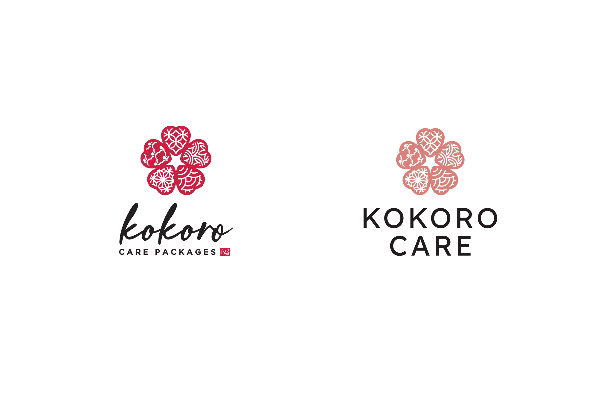
Years ago, I designed the original logo for then-fledgling company Kokoro Care Packages – a monthly subscription box of healthy, longevity-inspired, organic food from Japan delivered straight to your door. “Kokoro” literally means heart in Japanese, so I wanted to include the heart shape in my design. I created an icon of the sakura flower made up of hearts filled with different Japanese-inspired patterns – a nod to the different items coming together in the care packages.
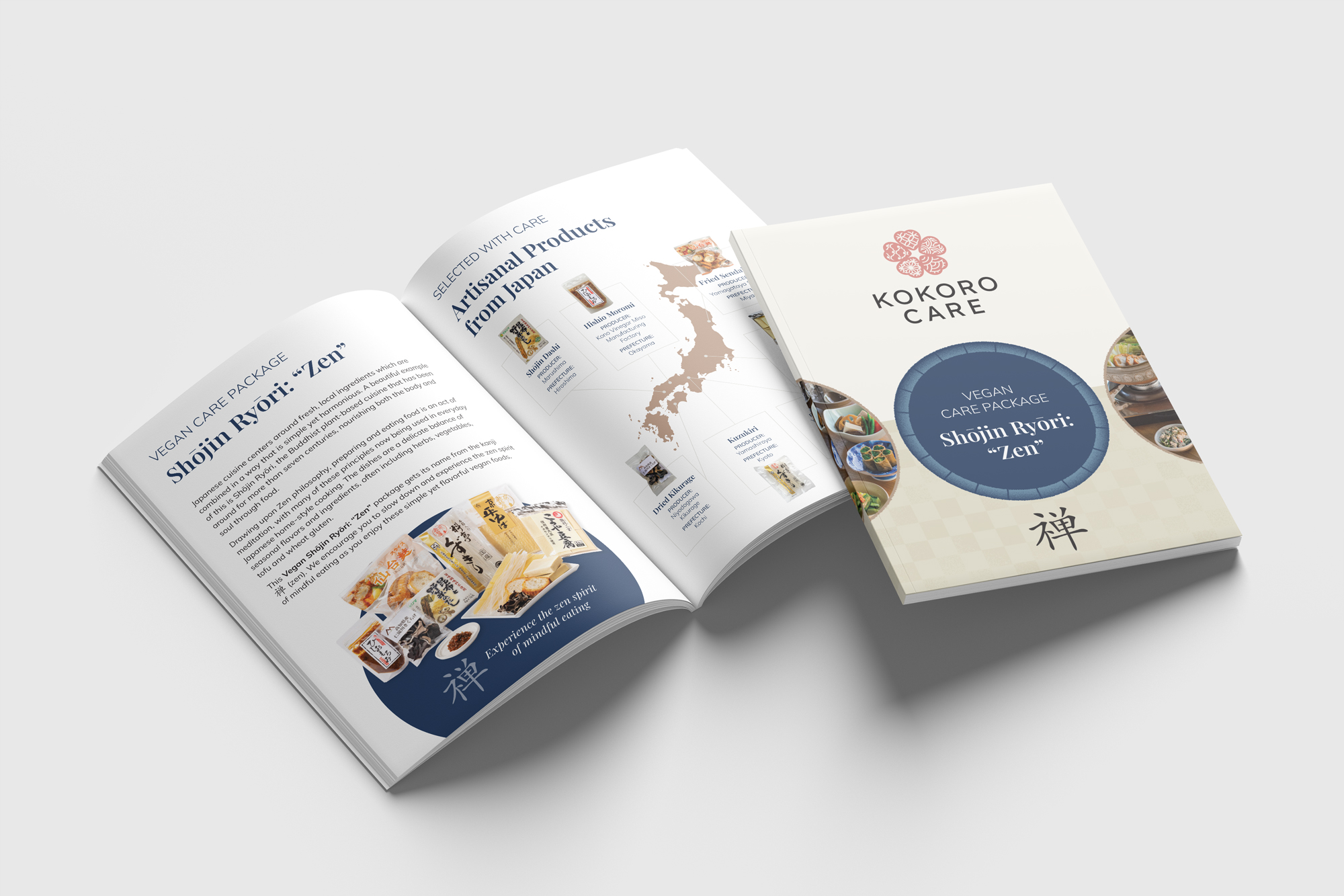
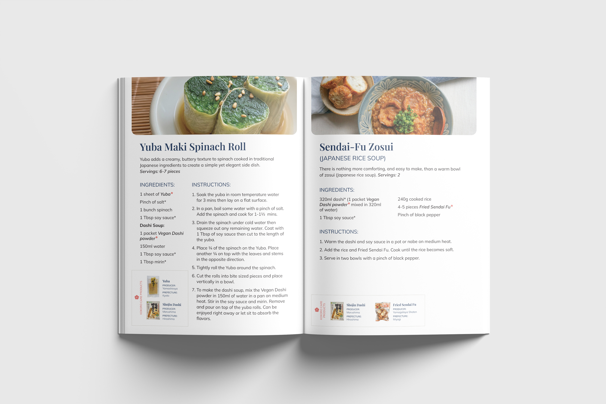
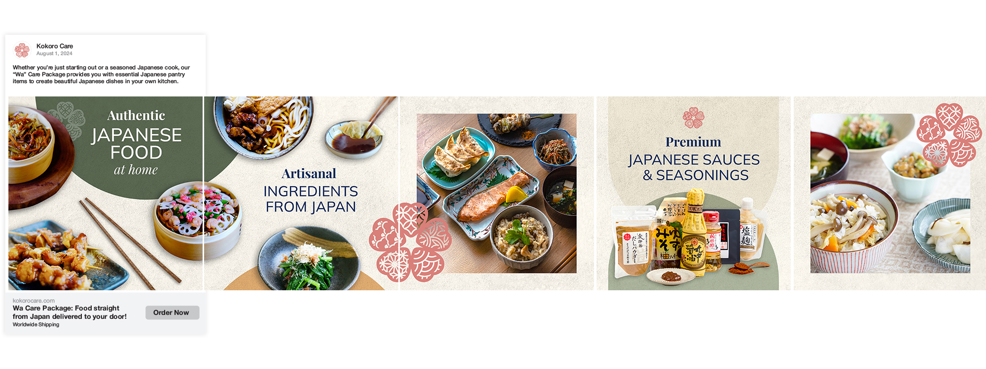
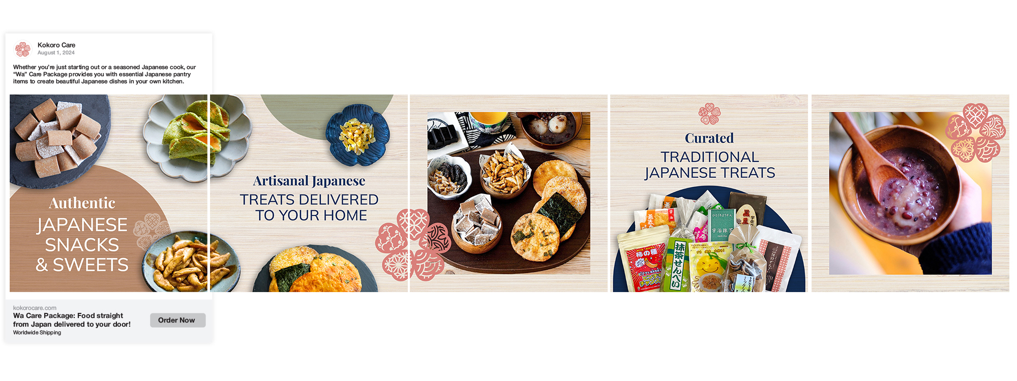
In 2024, Kokoro reached out to me again as they were reinventing themselves as “Kokoro Care”. They kept the original icon, but changed their name and font along with a new muted colour palette. Kokoro Care asked me to lay the foundation for their marketing materials online and in-print. I designed carousel ads for a few of their product lines, as well as a template for information booklets that would go in each of their care packages.
Category:
Date:
December 2, 2024


